On a website, an article must be visually attractive. Large blocks of text don’t pull the reader in and allow them to engage memorably. Journalists have to be creative in how they display the article’s information. Data has to be explained in a form that the general public can understand. Visual interactive aspects are both intriguing and easy to consume. Below you will find examples of design that I have used to make articles visually attractive, showcase the faces of a story, and present data in an easily comprehendible form.
Sidebars
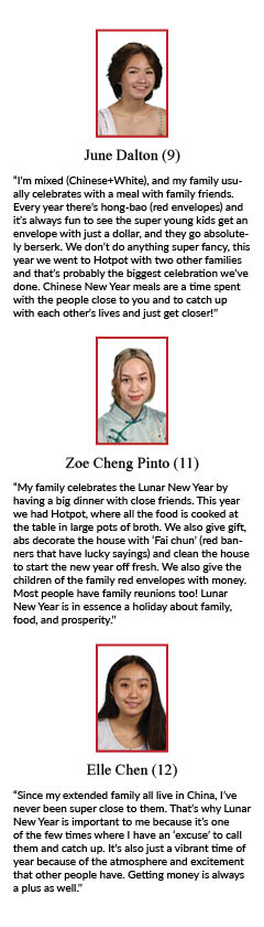
A guide to the Lunar New Year
Published on Rubicon Online on February 10, 2022
My design style is simple and clean, truly focusing on the subject. Sometimes the best way to showcase student faces and voices is a sidebar. When brainstorming and outlining my Lunar New Year story, it made sense to be a guide. Most of our community don’t celebrate Lunar New Year unless they take Chinese. Most of the community knows that the holiday exists, but not why it’s important to the people who celebrate. A day-by-day timeline made the most sense to explain the historical and cultural significance. To educate on the significance of the Lunar New Year, I have to show why it’s important to the community by showcasing the faces and voices of those who celebrate. This story relied on the connection between the global and local perspectives.
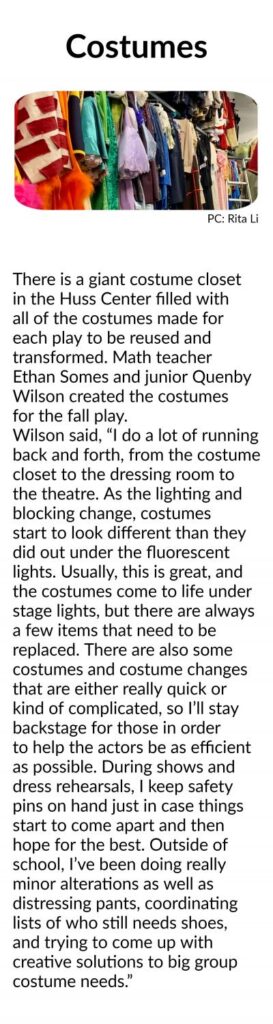
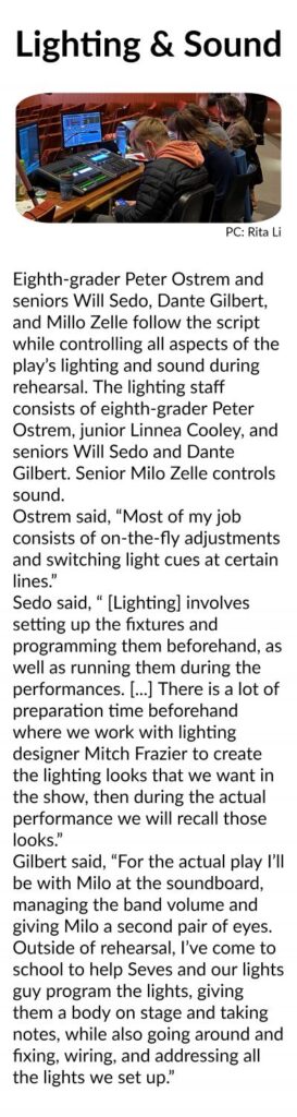
Live theater returns to Huss stage with Peter and the Starcatcher
Published on Rubicon Online on December 1, 2021
The story was produced with Rita Li and Ali Browne.
The multifaceted story was a part of an effort to add more interactive elements to the site. Staff members were separated into teams of three with a story topic and two visual aspects to incorporate. My group was assigned a photo story and sidebars. Our goal was to provide a backstage look into what students do to produce a theater production. I took charge of the sidebars, furthering our goal by gathering quotes from students who work in costumes, lighting, and sound. Using backstage photos to add a visual aspect, I asked students what their job entailed. While audience members don’t bring a bouquet for those working backstage, their jobs are equally necessary to produce a show.
Infographics
[SUSTAINABILITY & ETHICS] Reviewing the Marine Debris Tracker app
Published on Rubicon Online on May 15, 2021
My goal for the article was to show readers an easy, accessible way to help the climate that would lead to an immediate positive response in the community’s environment. To show that the Marine Debris Tracker app was a viable way to make a difference, I had to show that it was already making one. The app’s goal is to collect data for future initiatives, so I showed the data that the app had already gathered. Using a color scheme and adding animations made the infographic stand out compared to the text article.
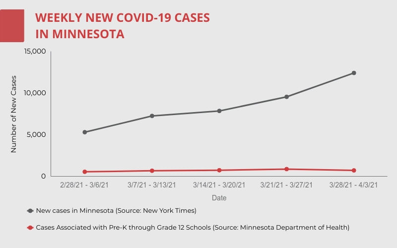
Increased vaccinations will not transform policies
Published on Rubicon Online on April 18, 2021
News educates its audience. During an event that impacts the entire community on the same level, such as a pandemic, journalists must share accurate information in a form that the general public can understand. This story covered how SPA responded to a surge of COVID-19 cases in Minnesota and an increased percentage of the student body and staff being vaccinated. The first infographic compiled information for vaccine locations in St. Paul, providing readers with an easy way to sign up for a vaccine. The second graph demonstrated how schools were not responsible for the COVID-19 surge, assuring readers that attending school was relatively safe.
Made with Visme Presentation Maker
Made with Visme Presentation Maker
Logo from nationalguard.mil (Elizabeth Trevathan)
Made with Visme Presentation Maker
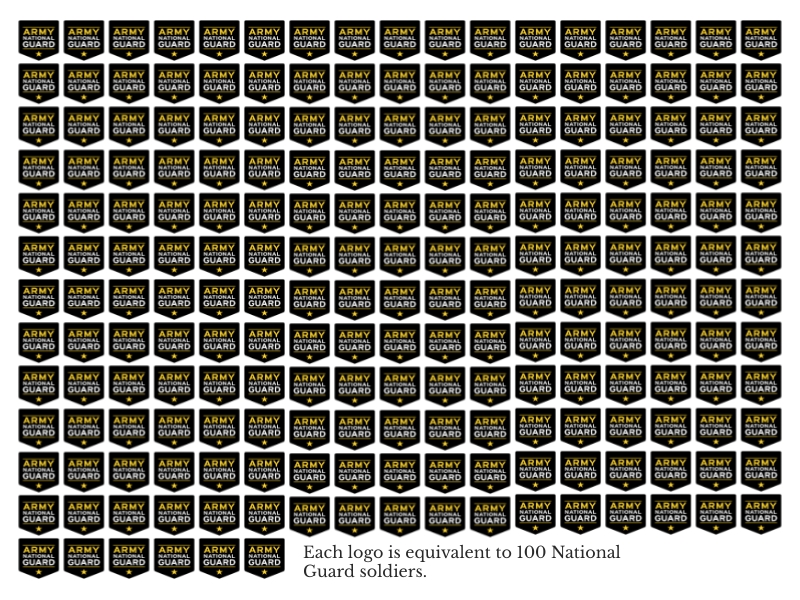
Heightened security, worry surround Inauguration
Published on Rubicon Online on January 19, 2021
As an article about how students felt about the upcoming Inauguration relied on data collected through a survey. The first infographic showcased how students thought about the election outcome and their predictions for Inauguration Day. This data helped me understand how the student body felt to cater the article to their perspective. The second infographic was educational and added to explaining the historical significance of the location where the Inauguration was held. The third infographic represents how many National Guard soldiers were on duty at the Capitol on Inauguration Day. The final infographic shows the impact of the Inauguration on the balance of political parties in the government. Together, these infographics provided the readers with data needed to understand the articles but in a visually appealing way.